Friday, May 16, 2008
Monday, May 12, 2008
Monday, April 28, 2008
Friday, April 25, 2008
Bestest Photoillustrations
Best Photoillustration
Wednesday, April 9, 2008
Wednesday, March 26, 2008
Austin Architecture
2. Surroundings
3. Surroundings
4. Surroundings
5. Surroundings
6. Lighting
7. Details
8. Angles
9. Surroundings
10. Surroundings
11. Lighting
12. Surroundings
13. Patterns
14. Angles
15. Angles
16. Angles
16 - The angles all pointing to the center seem to suck you in, then they lead you up to the sky. The tiles on the building give the eye something interesting to examine. The exposure is captured so the lighting makes the sides unimportant and all you can make out are the railings that act like vacuum lines. The fact that the angle perspective is looking up stairs, out of darkness and into the light sky, makes it feel like you're walking into freedom, "rising from the dead".
Friday, February 15, 2008
Bill Fortney
Wednesday, February 6, 2008
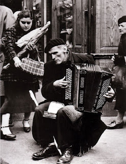
Langston Hughes and Gordon Parks
 This is an informal portrait. The outdoor lighting doesn't make any abstract effect, but strikes powerful shadows at the beggar's eyes and cheekbones. Looking to the floor expresses the sadness of the beggar, and the girl sympathizes.
Monday, January 28, 2008
Best Covers
2- Formal
3- Environmental
5- Environmental
9- Formal
10- Informal
11- Informal
15- Formal
18- Environmental
19- Formal
20- Environmental
21- Informal
22- Formal
24- Formal
26- Formal
27- Environmental
28- Informal
29a- Formal
29b- Informal
31- Environmental
32- Formal
35- Formal
36- Formal
37a- Formal
37c- Formal
37e- Formal

#31 Newsweek (November 20, 2000) This cover of the November 20, 2000 issue of Newsweek is entitled “The Winner Is…” with a photo of half George W. Bush and half Al Gore. The presidential election had taken place earlier that month, but there was still no clear winner declared because of the close ballot count in the state of Florida. In this issue, Newsweek chronicled the lawsuits, court challenges and endless counting of ballots. The following month, George W. Bush was declared the winner of the closest presidential election in United States history.
Even though this is a photoillustration combining two portraits, it is my favorite magazine portrait cover because the artist makes the two faces blend seamlessly together. You can tell there's a split between Gore's and Bush's faces but you can't make out aprecise line. The red and blue tie and border plays off of the whole event of the vote recounts that occured in the 2000 elections. The perfect centering of the white house behind them adds to the feeling of a split.
History of Magazine Covers
These covers mostly had words on the front. Some just started with an article right away like a newspaper, while others merely had the title and publisher info like a book. Some covers starting using illustrations but they were merely decorative. The covers never had any information about the contents, and only sometimes had symbolic images to convey a mood or idea about what was inside.
Poster Covers - 1890s-1960s
Single large, detailed images began to be used for magazine covers. Often they did not reveal anything about the contents but only expressed a theme. Occasionally cover lines were used to describe the major contents, but only in the empty space above or beneath the large image. These images were all paintings and artwork until 1936 when they started using photographs and portraits.
Marrying Pictures and Type - 1900s
During the 1900s covers starting integrating the images they showed and the words that gave information. The type became a part of the artwork, sometimes part of the picture overlapped the title or logo. Cover lines were used within the art piece and the font and color was used to make them fit in. The images of people became more unusual and expressive and th cover lines became more attention-grabbing.
Forest of Words - 1930s-present
Cover lines and attention-grabbing article headlines take priority on the cover. The contents of the magazine were presented informatively and excitingly. Cover lines and pictures overlap eachother to work together. Typography became just as important as the cover image itself, as covers try to keep up with the world of consumerism and immediate information.
Wednesday, January 23, 2008
Cool Portrait
 Now this is just cool. Is she on the floor? Is she falling? The flexible pose is really cool and the good exposure captures a perfect contrasting line around her. The background is plain gray, but the lighting is centered on her.


